Marketplace Platform v2.3 deprecation:We’re continuing to improve the Marketplace Platform to deliver stronger security, better performance, and new capabilities. As part of this evolution, Marketplace Platform v2.3 will be deprecated. To learn the dates and next steps, see Migration guide.
Interface methods is a mechanism that the developer platform provides, to enable your app to trigger certain actions on the Freshdesk UI.
Using interface methods an app can, on the Freshdesk UI,
- Display certain UI elements such as Modals, Dialog boxes, Confirmation boxes, and Notifications.
- Mimic click actions - such as starting or stopping a timer or navigating to specific pages.
- Show/Hide certain fields, field values, and elements (such as icons or other relevant information).
- Enable/Disable certain buttons.
- Set the values of certain fields.
Global interfaces
An app can display these interfaces/UI elements on any of the Freshdesk pages where the app is deployed. Regardless of where the app is deployed, the app can also mimic click actions that cause navigation to the ticket or contact details page and open these pages.
Display modals or dialog boxes
From your project’s root, navigate to the app directory and create a <modal or dialog or any-reasonable-name>.html file. In this file, enter the code to render the (front-end of the) Modal or Dialog box.
Navigate to the app.js file. Subscribe to the app.initialized event, through an event listener. When the app is initialized, the parent application (the product on which the app is deployed) passes a client reference to the app.
After app initialization, to display a Modal or Dialog box, use the following method:
Sample app.jsclient.interface.trigger("<method-name>", { title: "<Dialog box name>", template: "<path to the dialog.html file>" })<method-name> is showModal or showDialog
showModal method
The method displays a Modal in an IFrame. Events methods and Interface methods are not supported in a Modal - your app cannot react to click, change, or update events that occur inside a Modal and your app cannot trigger actions on the product UI from the Modal.
Installation parameters, Request method, Data method, and Data storage are supported in modals. If your app uses these methods from modals, in the modal.html file (or in any other equivalent file that you have added), ensure to include the following appclient resource.
<script src="{{{appclient}}}"></script>ImportantThe modal without backdrop is a beta feature and not available for all Freshdesk accounts.
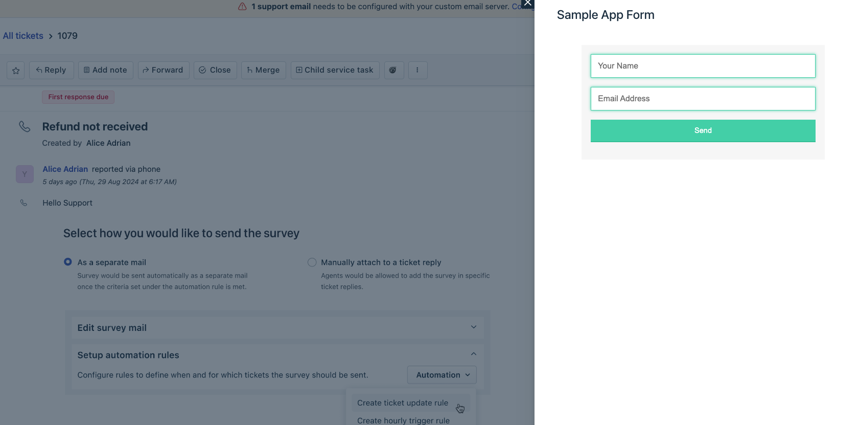 Modal dialog box
Use the sample code shown on the right pane, to enable your app to display a Modal, as part of the app logic.
You can retrieve the contextual information pertaining to the parent location from where a modal is triggered by using Instance method - Context. You can use the Instance methods - Send and Receive to enable communication between modals and any other app instance.
showDialog method
The method displays a Dialog box in an IFrame. Events methods and Interface methods are not supported in a Dialog box - your app cannot react to click, change, or update front-end events that occur inside a Dialog box and your app cannot trigger actions on the product UI from the Dialog box.
Installation parameters, Request method, Data method, and Data storage are supported in modals. If your app uses these methods from modals, in the dialog.html file (or in any other equivalent file that you have added), ensure to include the following appclient resource.
<script src="{{{appclient}}}"></script>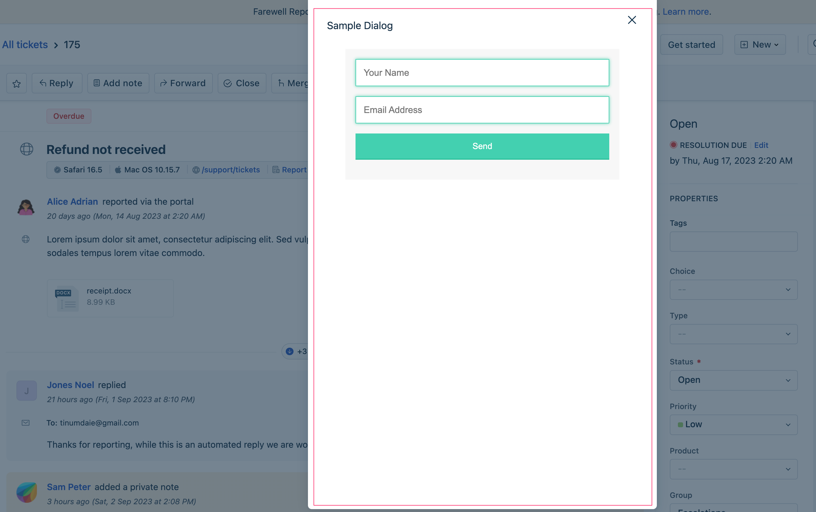 Dialog box
Use the sample code shown on the right pane, to enable your app to display a Dialog box, as part of the app logic.
You can retrieve the contextual information pertaining to the parent location from where a Dialog box is triggered by using Instance method - Context. You can use the Instance methods - Send and Receive to enable communication between modals and any other app instance.
Display confirmation messages
To enable your app to display standard confirmation-message boxes,
- Navigate to the app.js file. Subscribe to the app.initialized event, through an event listener. When the app is initialized, the parent application (the product on which the app is deployed) passes a client reference to the app.
- After app initialization, to display a confirmation message with default buttons, use the following method:
 client.interface.trigger("showConfirm", {
   title: "<Confirmation box name>",
   message: "<text message to be displayed seeking confirmation>"
 })
showConfirm method
The method displays a confirmation message box with a title, a message, and the save and cancel buttons. By default, the message box displays the SAVE and CANCEL buttons. You can customize the button names.
Time-out information:Timeout for Confirmation message box is 10 seconds.
Use the sample code shown on the right pane > Default buttons tab, to enable your app to display a Confirmation message box (with SAVE and CANCEL buttons), as part of the app logic.
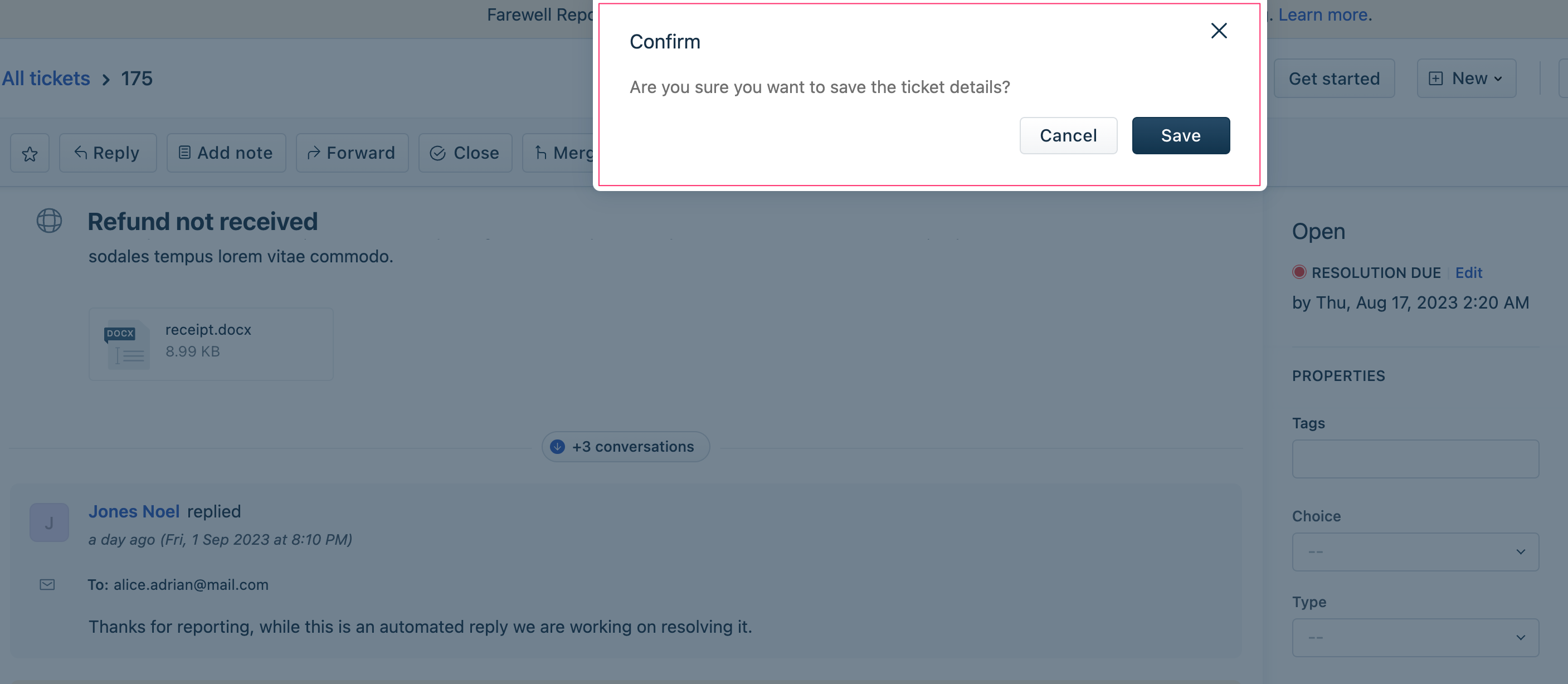 Confirmation message box - Default buttons
Display notifications
To enable your app to display notifications,
Navigate to the app.js file. Subscribe to the app.initialized event, through an event listener. When the app is initialized, the parent application (the product on which the app is deployed) passes a client reference to the app.
After app initialization, to display a notification, use the following method:
Sample app.jsclient.interface.trigger("showNotify", { type: “<Possible values: info, success, warning, danger, alert>”, title: "<Display name>", message: "<text message to be displayed in the notification box>" } )
showNotify method
The method displays a notification box with a title and notification message (can be an info message, a success message, a cautionary note, a warning message, or a critical message which, if ignored, can fail the system).
Use the sample code shown on the right pane, to enable your app to display various notification messages, as part of the app logic.
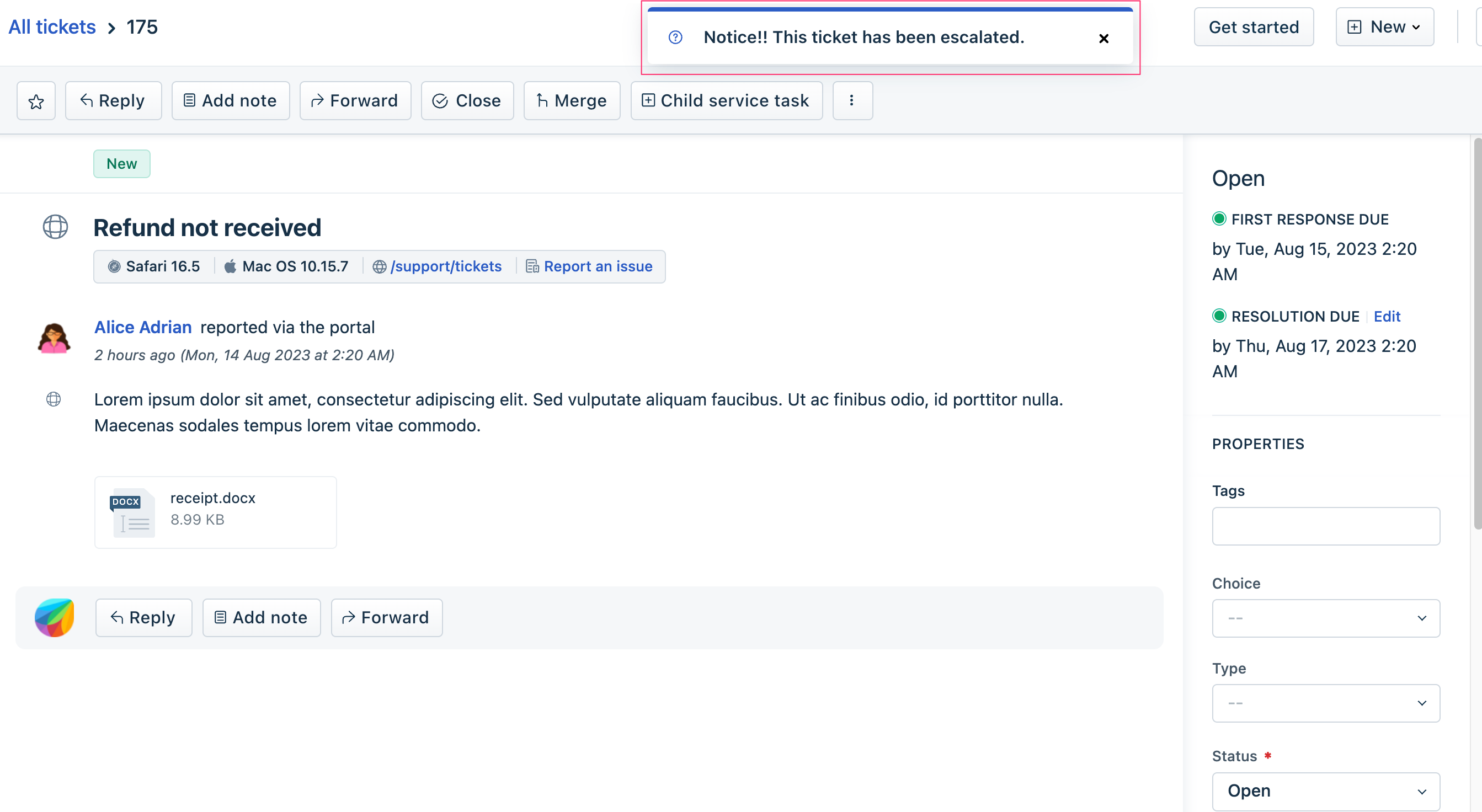 Notification box with an info message
Open ticket or contact details page
To enable your app to open the ticket or contact details pages,
Navigate to the app.js file. Subscribe to the app.initialized event, through an event listener. When the app is initialized, the parent application (product on which the app is deployed) passes a client reference to the app.
After app initialization, to open specific pages, use the following method:
Sample app.jsclient.interface.trigger("click", { id: "<ticket or contact>", value: <id of the ticket to be opened> })id: “ticket” opens the Ticket details page of the ticket whose ticket-id is specified in value.
id: “contact” opens the Contact details page of the contact whose contact-id is specified in value.
click method
The method opens the ticket or contact details page of a specific ticket or contact. Use the sample code shown on the right pane, to enable your app to open the ticket or contact details page.
Display or hide CTI dialler
To enable an app deployed at the cti_global_sidebar to open or hide a phone dialler,
- Navigate to the app.js file. Subscribe to the app.initialized event, through an event listener. When the app is initialized, the parent application (product on which the app is deployed) passes a client reference to the app.
- After app initialization, to open or hide the dialler in an iFrame, use the following method:Sample app.js
client.interface.trigger("<show or hide>", {
  id: "softphone"
})
show or hide method - for dialler
Use the sample codes shown on the right pane, to enable your CTI app to open or hide the phone dialler in an iFrame.
Display or hide missed calls
To enable an app deployed at the cti_global_sidebar to display or hide the number of missed calls on the CTI widget,
Navigate to the app.js file. Subscribe to the app.initialized event, through an event listener. When the app is initialized, the parent application (product on which the app is deployed) passes a client reference to the app.
After app initialization, to display or hide the number of missed calls, use the following method:
Sample app.jsclient.interface.trigger("<show or hide>", { id: "missedCall" })
show or hide method - for the number of missed calls on the CTI widget
Use the sample codes shown on the right pane, to enable your CTI app to display or hide the number of missed calls on the CTI widget.
Hide/display or enable/disable UI elements
To enable your app to hide an UI element, display a hidden element, disable a UI button, or enable a disabled button,
- Navigate to the app.js file. Subscribe to the app.initialized event, through an event listener. When the app is initialized, the parent application (the product on which the app is deployed) passes a client reference to the app.
- After app initialization, to a hide/display or enable/disable UI element, use the following method:<method-name> is the action to be performed. Possible values: hide, show, enable, disableapp.js
client.interface.trigger("<method-name>", {
  id: "<element-name>"
})
<element-name> is the element to be hidden or displayed; disabled or enabled.
Set the value of a field
To enable your app to set the value of a UI field,
Navigate to the app.js file. Subscribe to the app.initialized event, through an event listener. When the app is initialized, the parent application (the product on which the app is deployed) passes a client reference to the app.
After app initialization, use the following method:
app.jsclient.interface.trigger("setValue", { id: "<element-name>", value: "<value to be set>" })<element-name> is the element whose value is to be set.
Set the options of a drop-down field
To enable your app to set the options of a drop-down UI field,
Navigate to the app.js file. Subscribe to the app.initialized event, through an event listener. When the app is initialized, the parent application (the product on which the app is deployed) passes a client reference to the app.
After app initialization, use the following method:
app.jsclient.interface.trigger("setOptions", { id: "<element-name>", value: [value1, value2] })<element-name> is the element whose drop-down list is to be populated.
[value1, value2] are the drop-down options, specified as an array.
Mimic click actions
A button click on the product UI, performs an action. For example, button clicks can start a timer, stop a timer, expand a collapsed item, open a window, and so on. Your app can mimic certain button clicks and perform the subsequent actions. To enable your app to do this,
Navigate to the app.js file. Subscribe to the app.initialized event, through an event listener. When the app is initialized, the parent application (the product on which the app is deployed) passes a client reference to the app.
After app initialization, to mimic a click action, use the following method:
app.jsclient.interface.trigger("click", { id: "<action to be performed>" })To start a timer, use the following method:
app.jsclient.interface.trigger("start", { id: "timer", value: {<payload needed for the timer action, specified as an object of key:value pairs}})To stop a timer, use the following method:
app.jsclient.interface.trigger("stop", { id: "timer" })
UI elements that the app can act on
attachments
Use the sample code on the right pane, to hide attachments or display already hidden attachments.
 This image highlights the element the app can act on
attachmentsDelete
Use the sample code on the right pane, to hide or display the delete icon that helps to remove attachments.
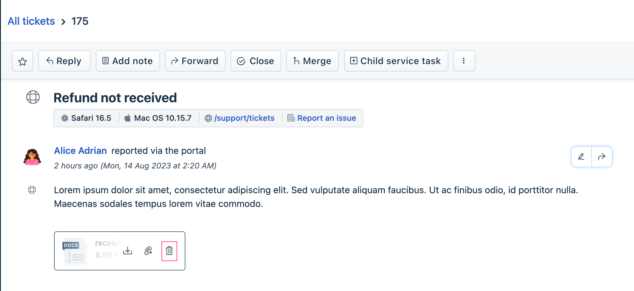 This image highlights the element the app can act on
ticketSpam
Use the sample code on the right pane, to hide the Spam menu-option from the menu shown in the following image.
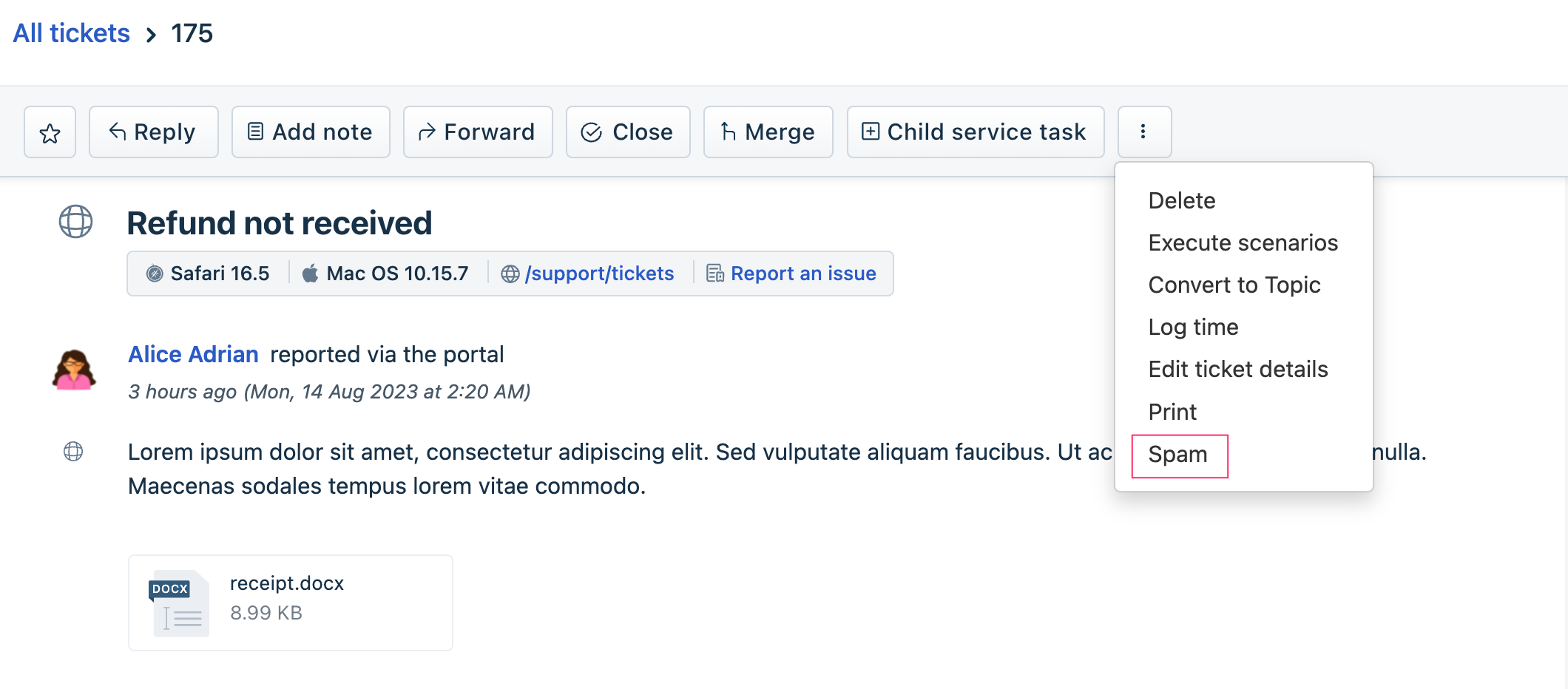 This image highlights the element the app can act on
ticketEdit
Use the sample code on the right pane, to hide, display, disable, or enable the (ticket) Edit icon.
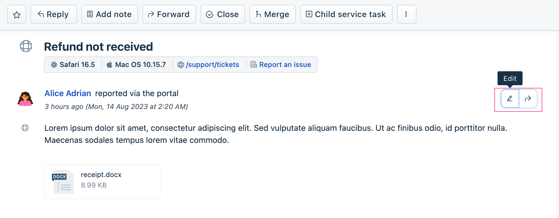 This image highlights the element the app can act on
ticketDelete
Use the sample code on the right pane, to hide or display the Delete menu-option from the menu shown in the following image.
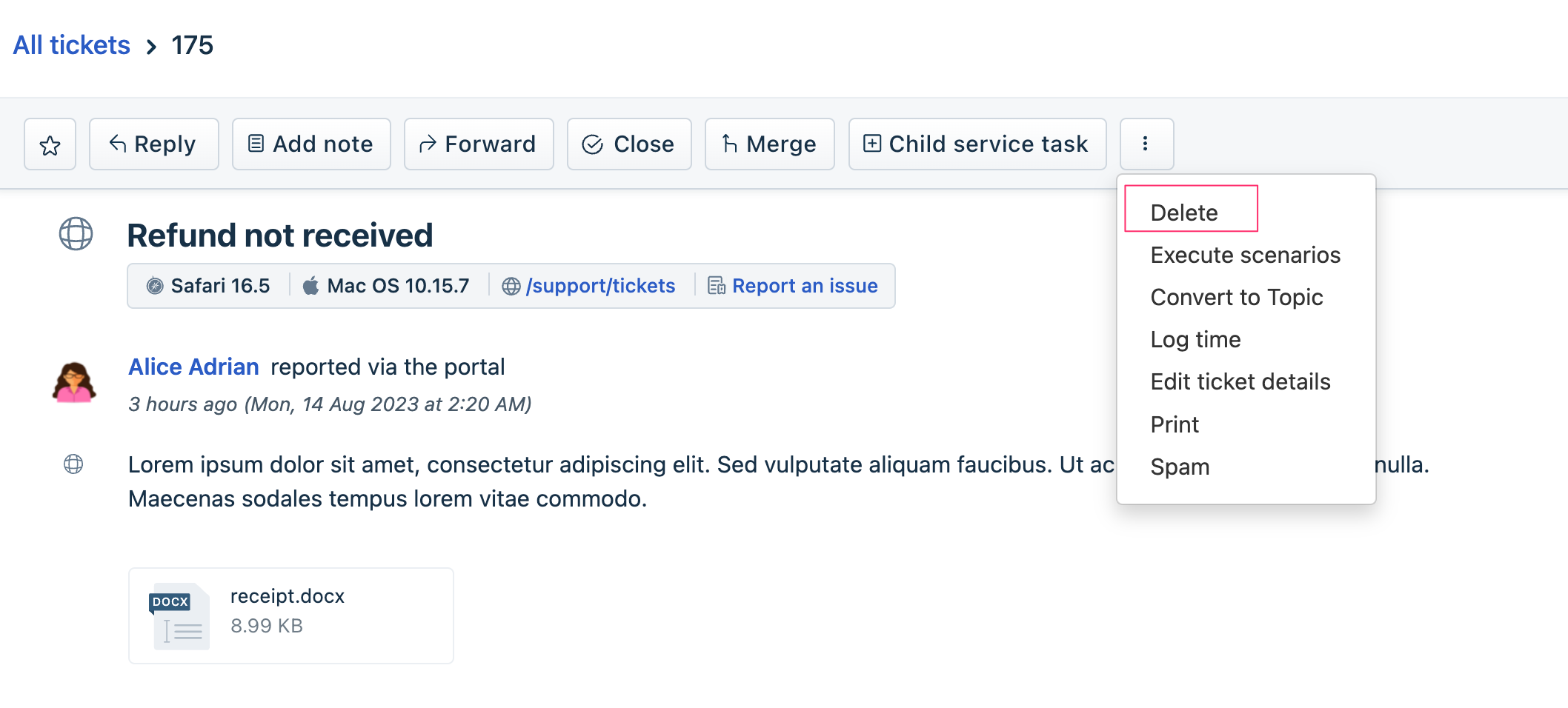 This image highlights the element the app can act on
ticketDueBy
The product UI has an Edit link that enables editing the Resolution due by date associated with a ticket. The link is highlighted in the following image. Use the sample code on the right pane, to enable your app to hide or display this link.
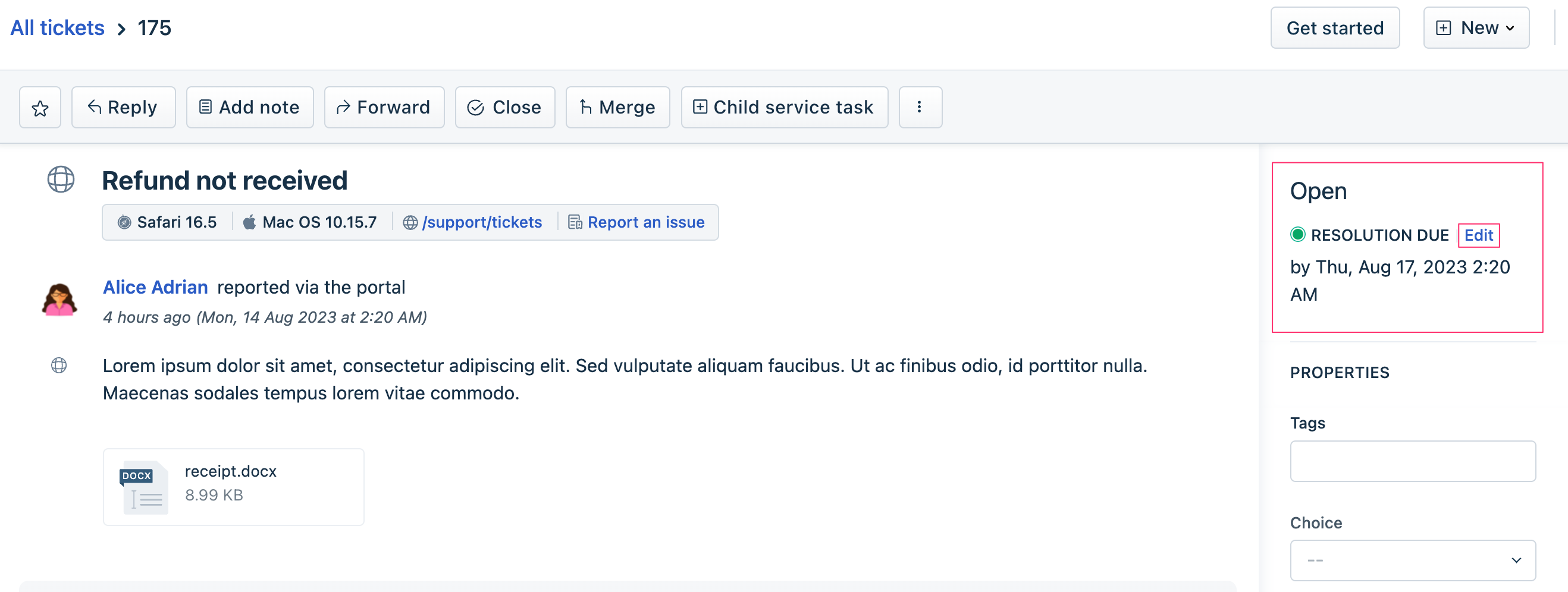 This image highlights the element the app can act on
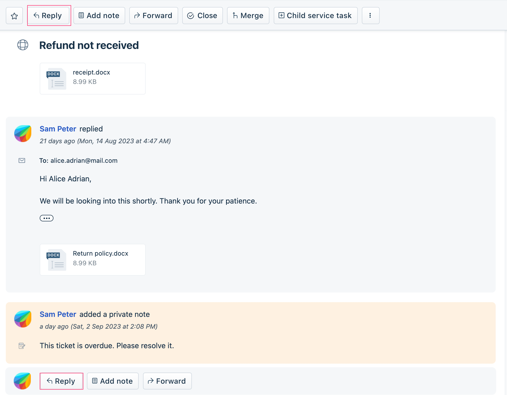
reply
Use the sample code on the right pane, to hide/display or disable/enable the Reply button in the top and bottom tool bar of the conversation window.
 This image highlights the element the app can act on
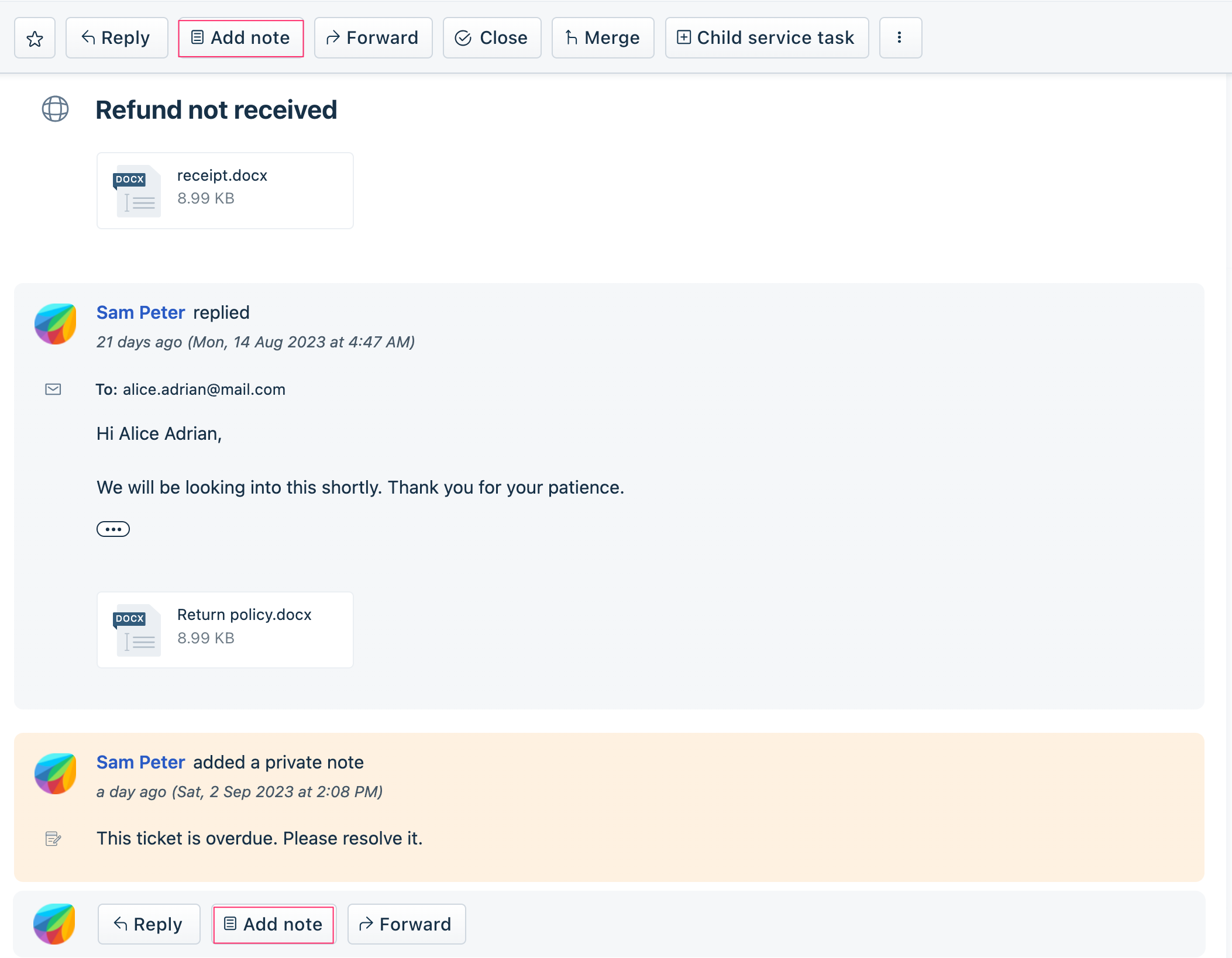
note
Use the sample code on the right pane, to hide/display or disable/enable the Add note button in the top and bottom tool bar of the conversation window.
 This image highlights the element the app can act on
forward
Use the sample code on the right pane, to hide/display or disable/enable the Forward button in the top and bottom tool bar of the conversation window.
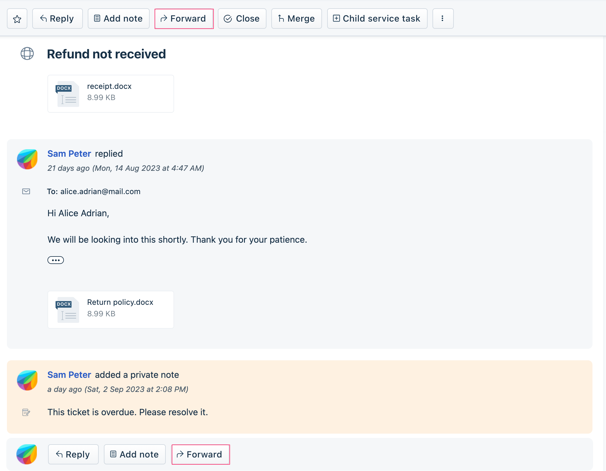 This image highlights the element the app can act on
noteEdit
For a conversation on the Ticket Details page, an Edit icon is displayed for all notes added to the conversation. Use the sample code on the right pane, to enable your app to hide/display this icon (for all notes).
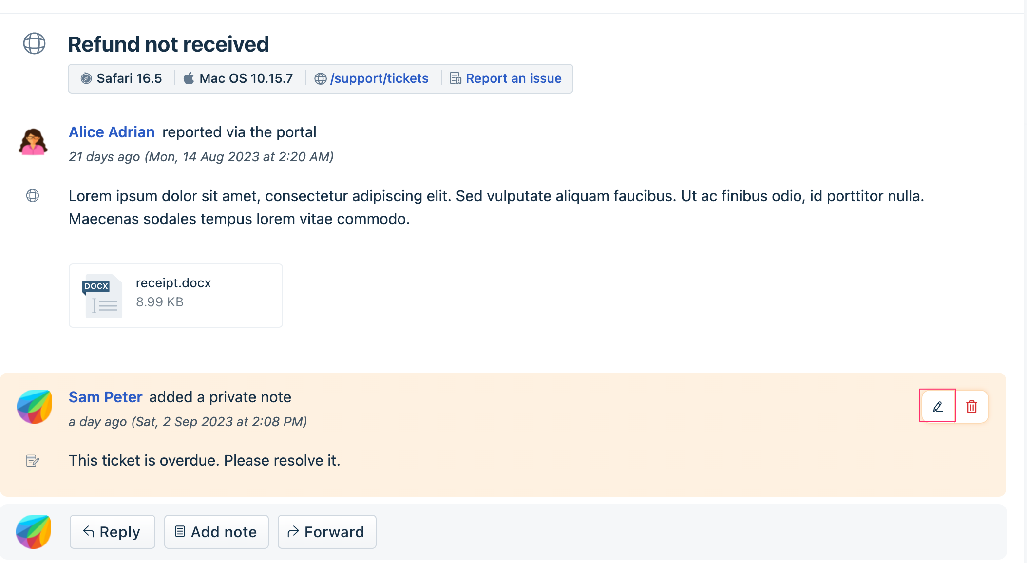 This image highlights the element the app can act on
timer
An agent working on a ticket can choose to record the time spent on the ticket. The agent can use the timer available on the product UI, to do this. Your app can mimic the agent’s actions, and start or stop a running timer. If the app starts a timer when a timer is already running, the running timer is stopped and a new timer is started.
Use the sample code on the right pane, to enable your app to start or stop a timer.
 This image highlights the element the app can act on
expandConversation
In a ticket thread, if the number of replies and notes exceed a certain limit, the older replies and notes are in collapsed format. Use the sample code on the right pane, to enable your app to expand the collapsed items and let an agent view the entire conversation.
PROPERTIES widget fields
The product UI displays all ticket properties in the PROPERTIES widget of the Ticket details page. The PROPERTIES widget is highlighted in the image.
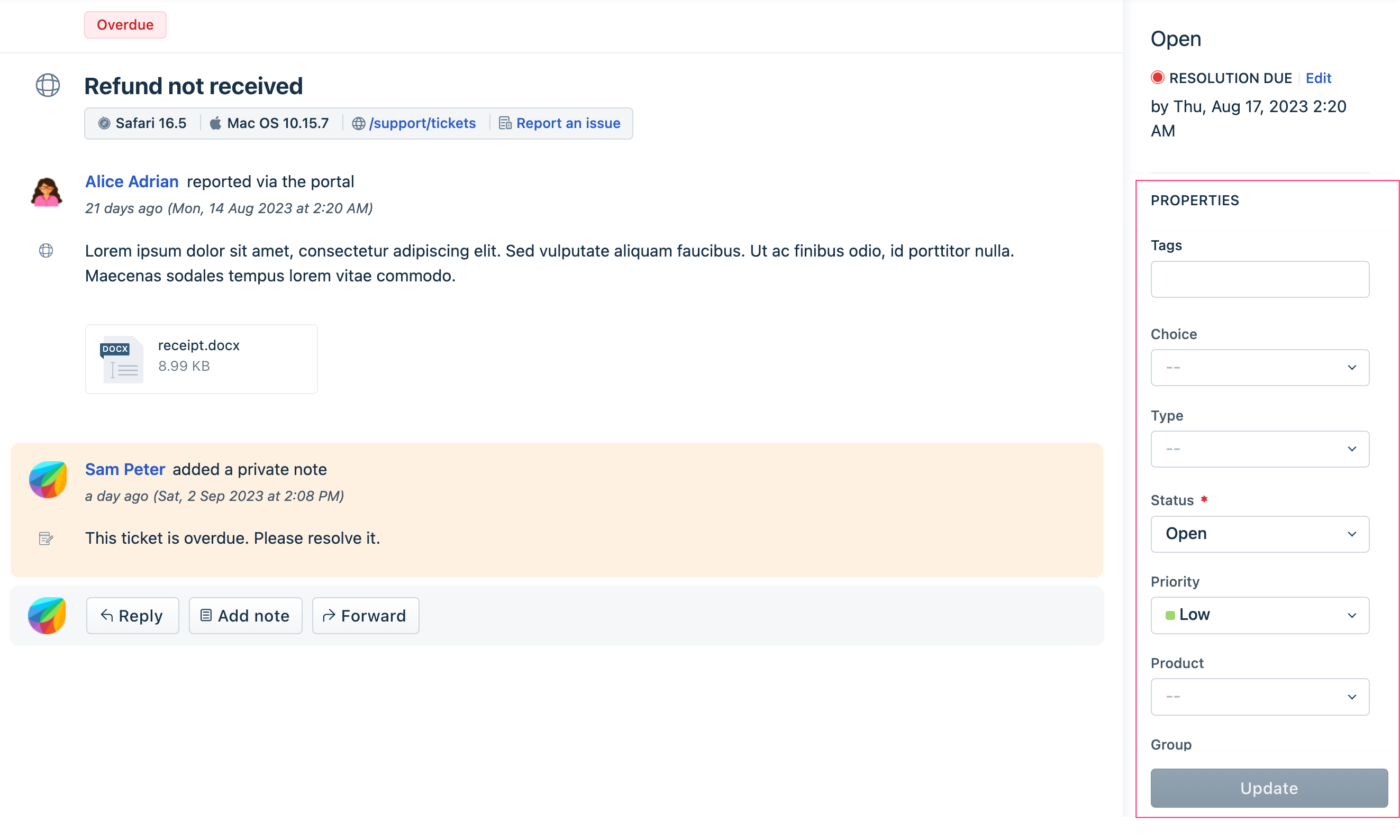 This image highlights the Properties widget
An app can act on the following elements (fields) of the PROPERTIES widget.
| Field (default display) name | Element name to be used in app.js |
|---|---|
| Status | status |
| Priority | priority |
| Type | ticket_type |
| Group | group |
| Product | product |
| Custom field | cf_custom_field |
| Tags | tag |
Use the sample code on the right pane, with the appropriate element name, to hide, display, disable, or enable these fields.
setValue: Your app can set a value for a PROPERTIES widget field. Use the sample code on the right pane with the appropriate element name, to set a field’s value.
setOptions: All PROPERTIES widget fields are drop-down fields. Your app can set all the options of a drop-down field. Use the sample code on the right pane with the appropriate element name, to do this.
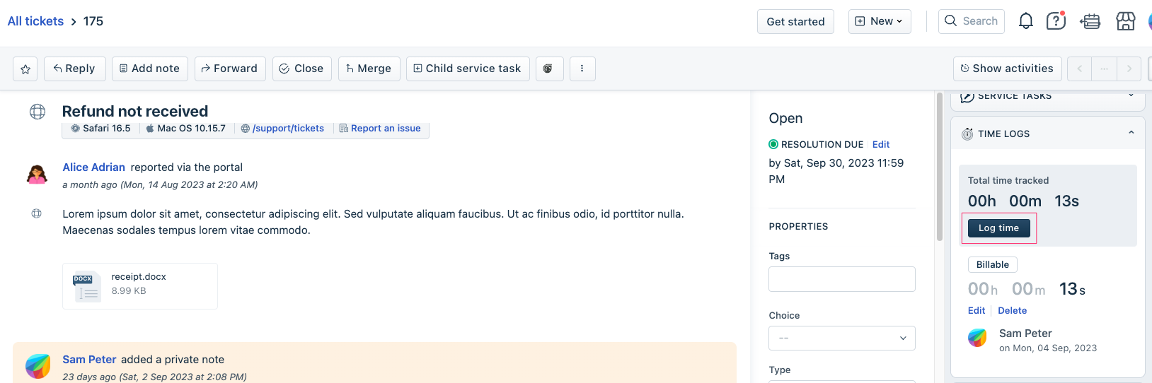
Log time window fields
An agent working on a ticket can choose to record the time spent on the ticket. The agent can do this by navigating to the Ticket Details page > TIME LOGS widget > Log time window. An app can act on the following elements (fields) of the Log time window.
| Field (default display) name | Element name to be used in app.js |
|---|---|
| Billable | timerBillable |
| Agent | timerAgentId |
| Note | timerNote |
| HH:MM | timerSetTime |
| On | timerExecuteAt |
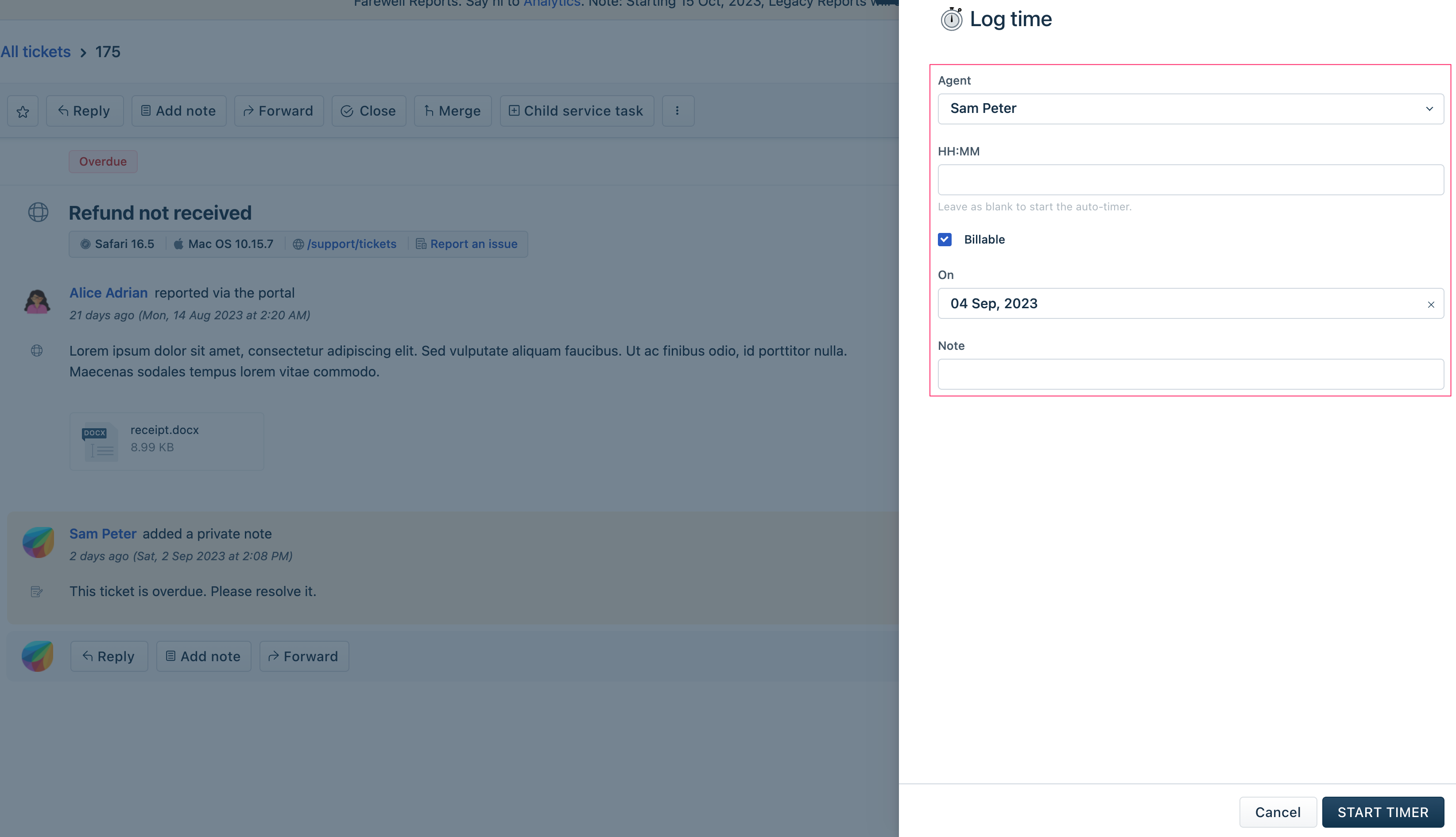 This image highlights the Log time window fields that the app can act on.
Important: Only an app deployed at the time_entry_backgroud placeholder can act on the Log time window fields. Use the sample code on the right pane, with the appropriate element name, to enable your app to hide/display or disable/enable the Log time window fields.
setValue: Your app can set a value for a Log time window field. Use the sample code on the right pane with the appropriate element name, to set a field’s value.
Editor window fields
When an agent replies or adds a note to a ticket, the Reply or Note editor is displayed. The app can act on the following elements of the Editor window.
| Field (default display) name | Element name to be used in app.js |
|---|---|
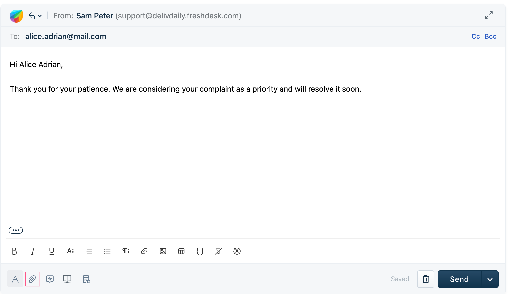
| From | from |
| To | to |
| Cc | cc |
| Bcc | bcc |
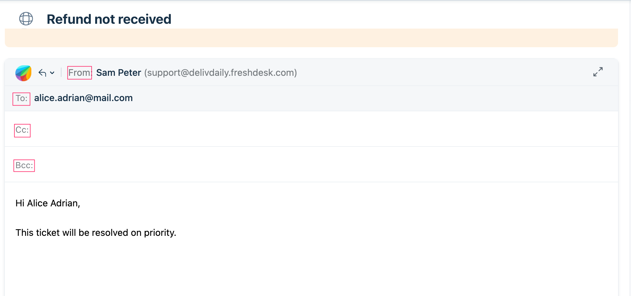 This image highlights the Editor window elements that the app can act on.
Use the sample code on the right pane, with the appropriate element name, to hide, display, disable, or enable these fields.
setValue: Your app can set a value (or multiple values) for an Editor window field. Use the sample code on the right pane with the appropriate element name, to set a field’s value.
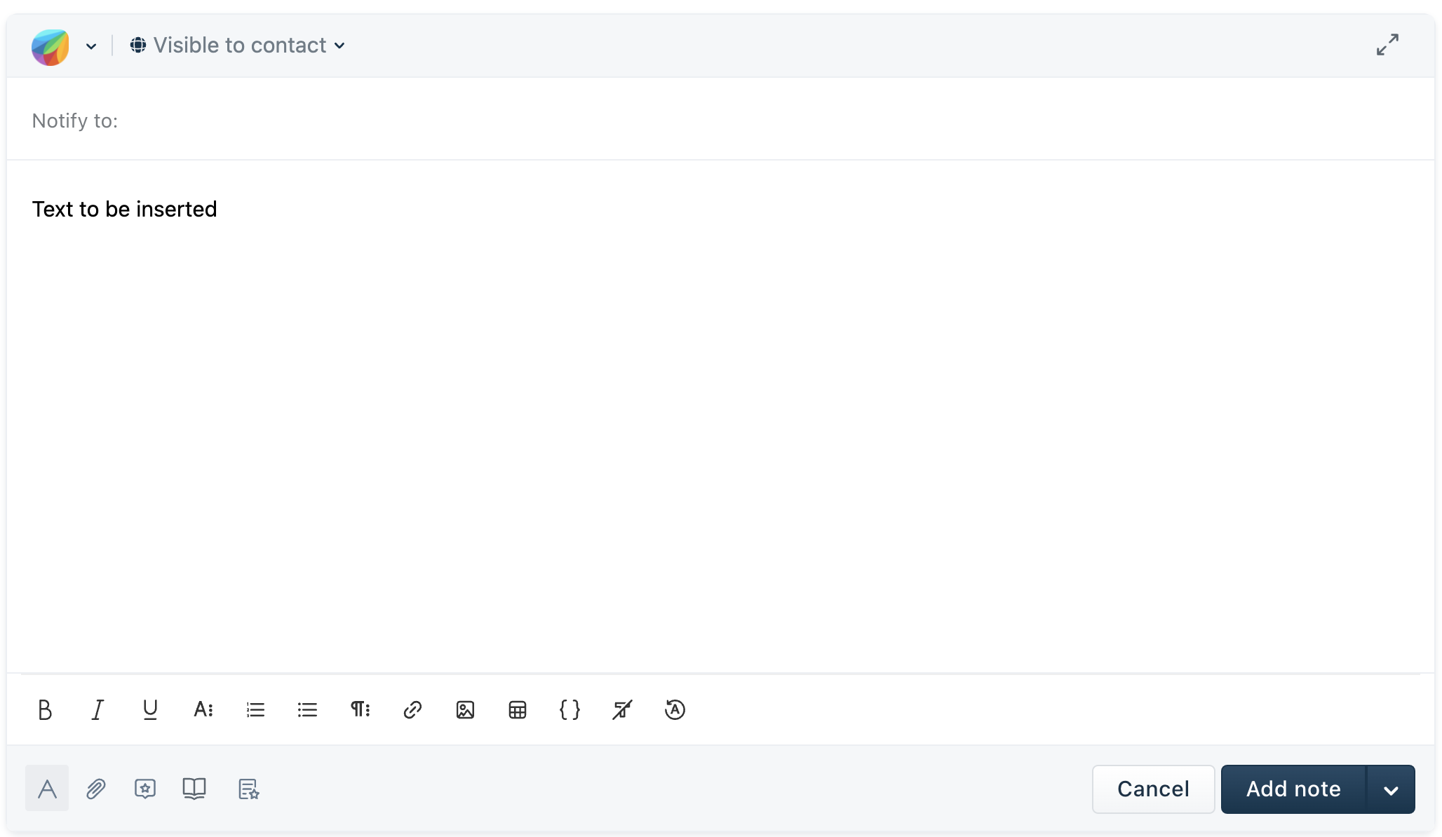
Open the reply editor window with a text insert
Use the sample code on the right pane, to enable your app to mimic a click action on the Reply button and open the reply editor window with a text inserted in the window. If the window has an existing text by default, this app action replaces the text.
Note:If the ticket.replyClick event method is used in app.js, this interface method triggers the event method and invokes the associated callback.
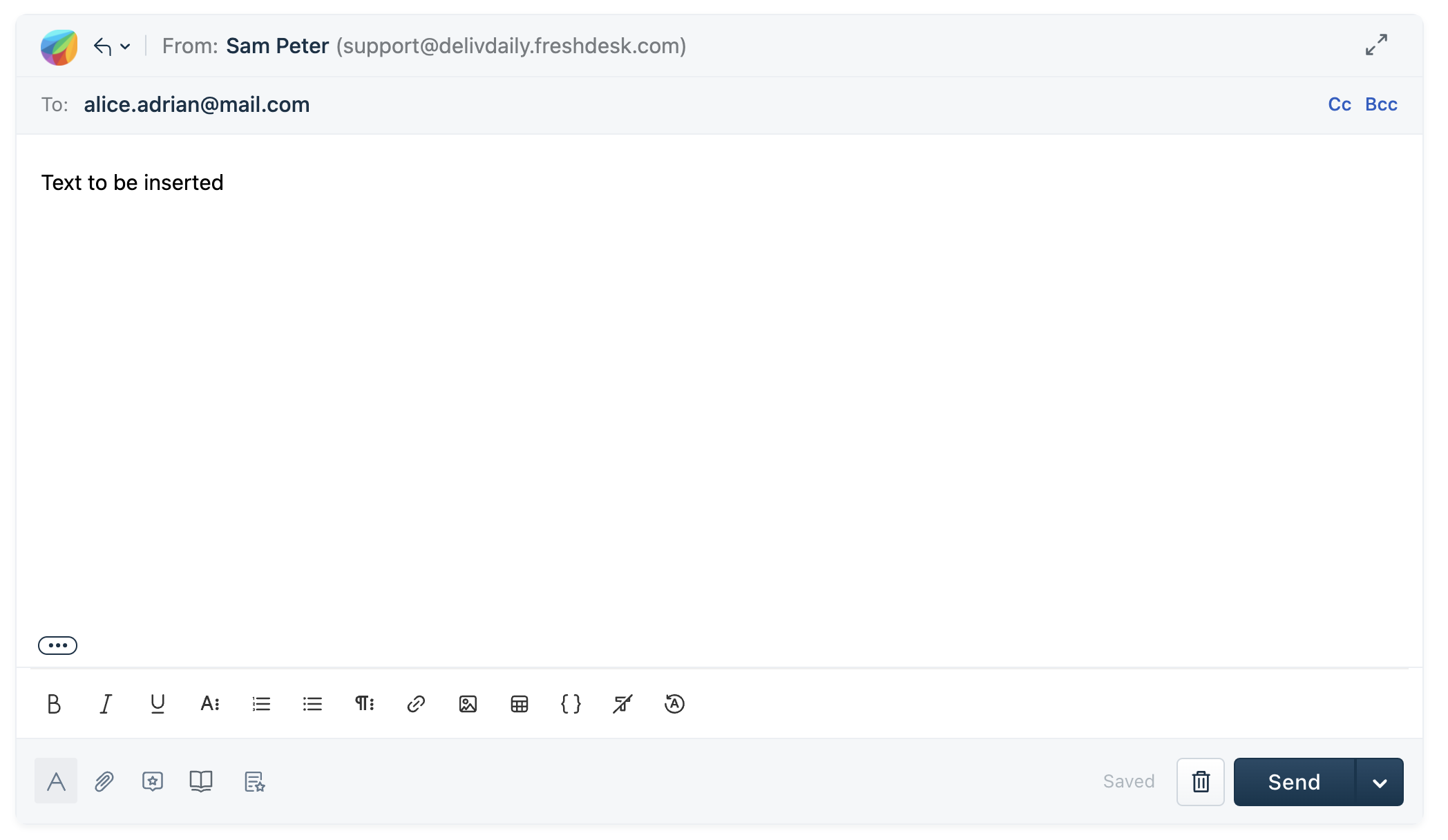 This image highlights the reply editor with a text insert
Reply without the show-quoted-text link
Use the sample code on the right pane, to enable your app to remove the show-quoted-text element from a reply. If this interface method is triggered before the Reply Editor window is opened, the Reply Editor window does not contain the show-quoted-text element. If this method is triggered after the Reply Editor window is opened, the window has the element but it is removed from the reply sent.
Note:If the ticket.replyClick event method is used in app.js, this interface method triggers the event method and invokes the associated callback.
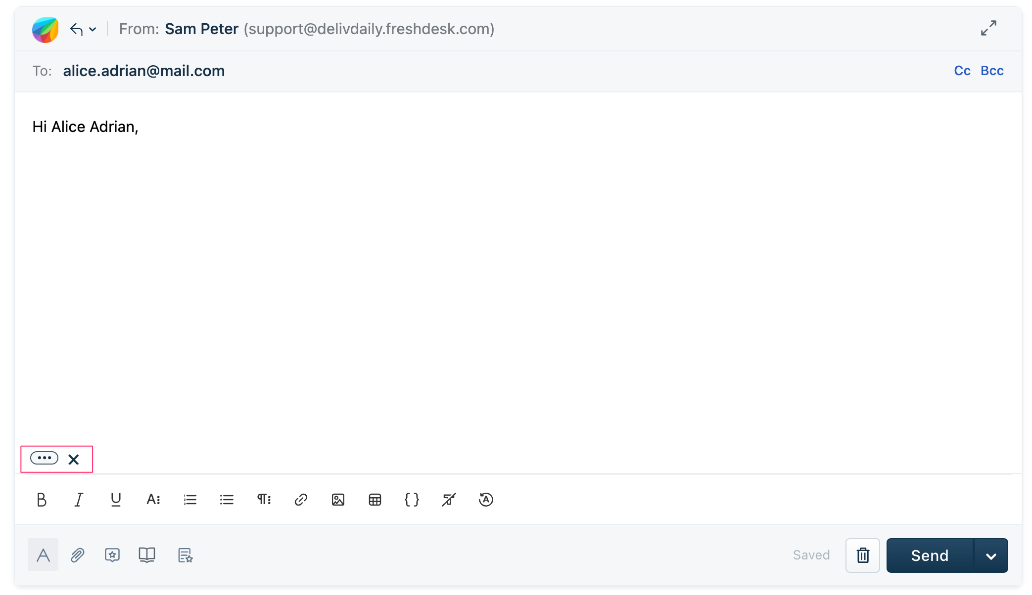 This image highlights the show-quoted-text element that the app acts on
Open the note editor window with a text insert
Use the sample code on the right pane, to enable your app to open the note editor window with a text inserted in the window. If the window has an existing text by default, this app action replaces the text.
Note:If the ticket.notesClick event method is used in app.js, this interface method triggers the event method and invokes the associated callback.
 This image highlights the note editor with a text insert
setValue of noteType - A note added to a conversation can be a public or private note. These are the note’s types. Your app can set a value for the note type in the Note Editor window. Use the sample code on the right pane, to enable your app to set a note’s type. The app user can modify the set note-type as the other type is also available for app user’s consumption.
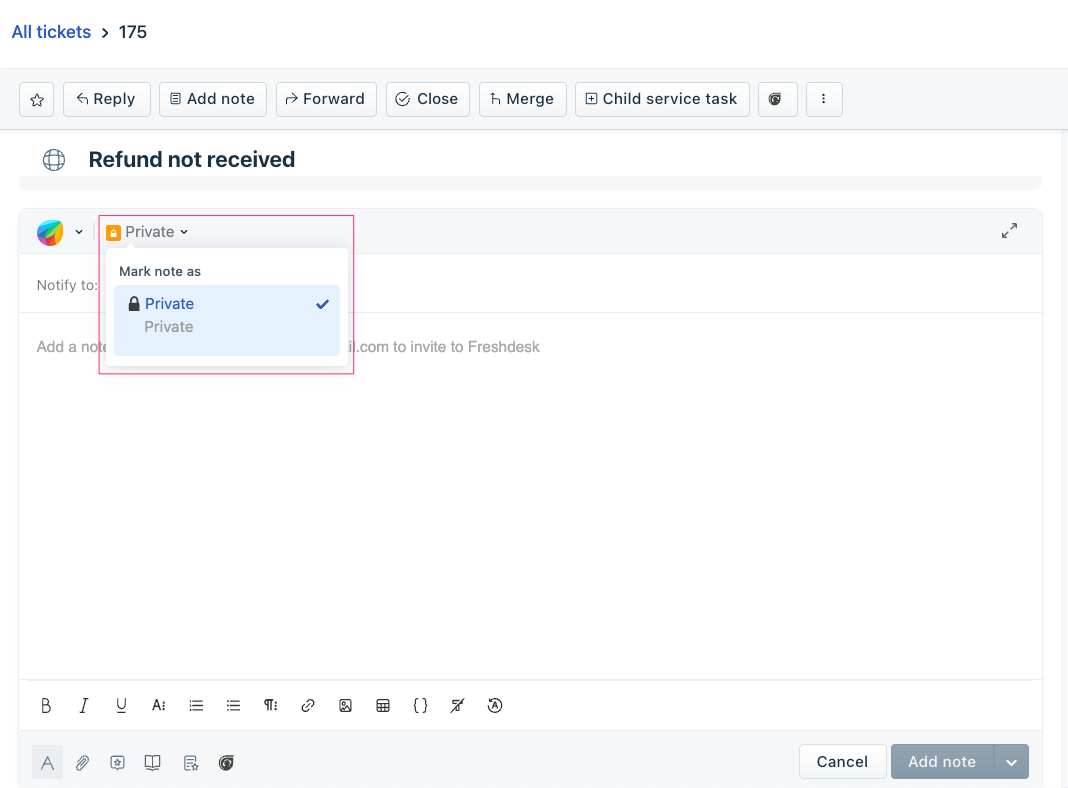 This image highlights the note type options
setOptions of noteType - A note added to a conversation can be a public or private note. These are the note’s types. Your app can set options for the note type in the Note Editor window. Use the sample code on the right pane, to enable your app to do this. If only one option is set, the app user cannot modify the set note-type as the other type is hidden.
This image highlights the note type optionssetValue of Notify to - When an agent adds a note to a conversation, the agent can add the email-id(s) to which a notification is sent. Your app can set the value(s) of this Notify to field. Use the sample code on the right pane, to enable your app to set the value(s) of the Notify field.
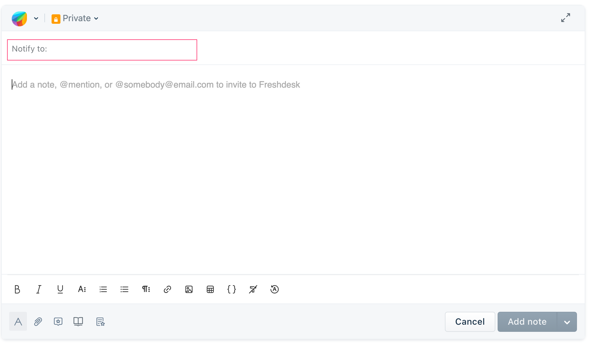 This image highlights the Notify field whose value the app can set
setValue of the text box in an already open Editor window - Use the sample code on the right pane, to enable your app to add to or replace the existing text in an already open Editor window. The Editor window can be a Reply, Note, or Forward Editor window. The app can also add attachments.
Important:Only an app deployed at the ticket_conversation_editor placeholder can setValue of an already open editor.
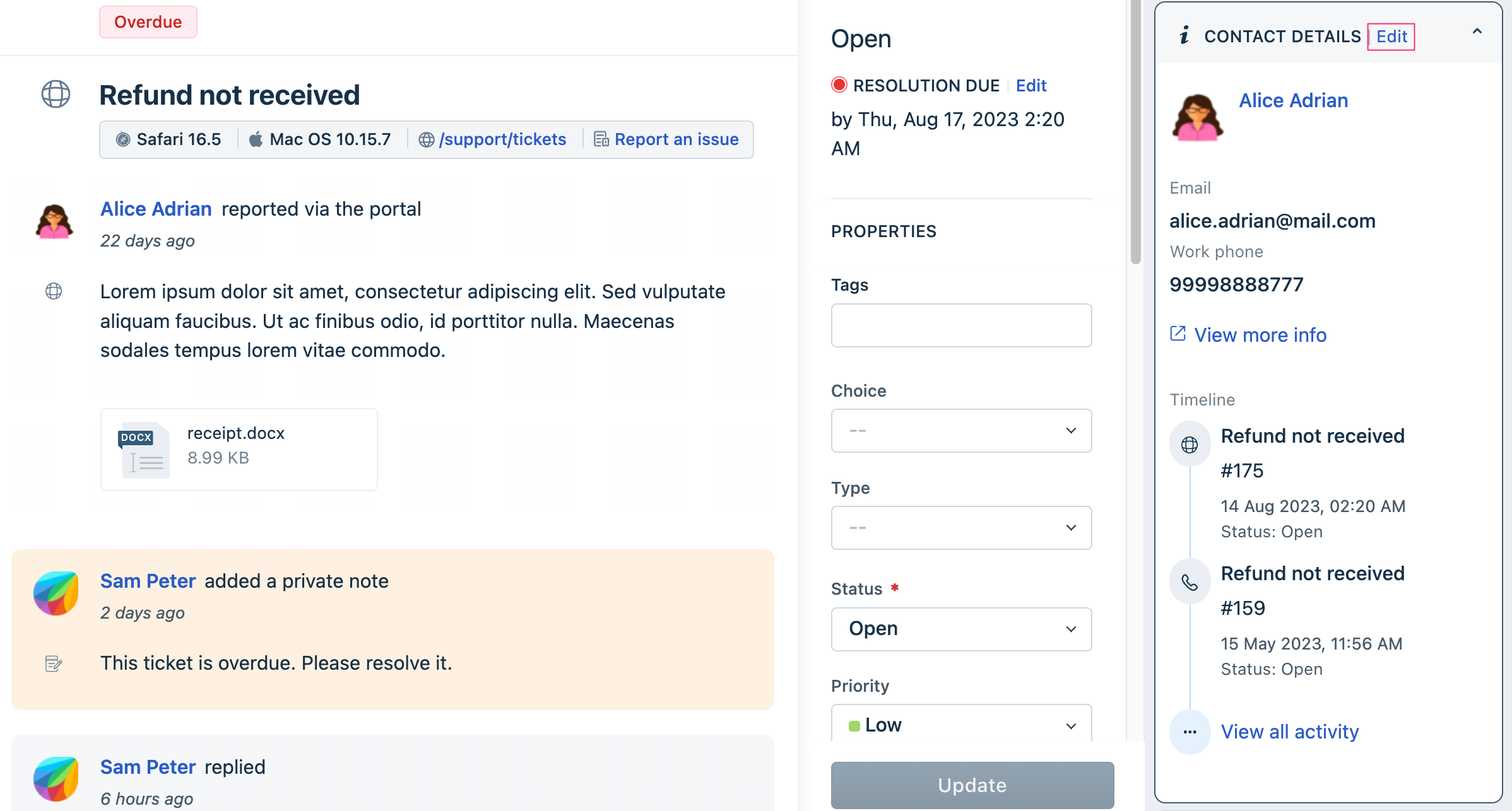
CONTACT DETAILS widget and Edit contact details window fields
The product UI displays the contact details, of the contact associated with a ticket, in the CONTACT DETAILS widget of the Ticket details page.
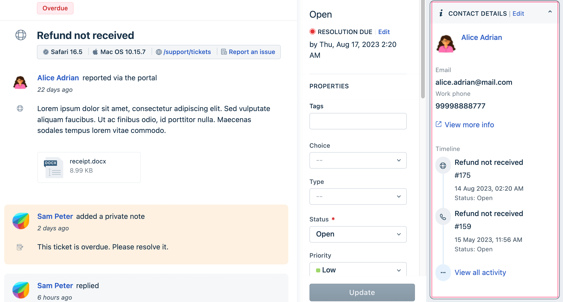 This image highlights the CONTACT DETAILS widget
An agent can use the Edit icon, in the expanded widget and view the Edit contact details window.
 This image highlights the Edit contact option.
An app can act on the following elements (fields) of the CONTACT DETAILS widget and the Edit contact details window. The app can also act on the company details associated with the contact.
Important:- If an app hides/shows or disables/enables an element in the Edit contact details window, it is unavailable/available in the CONTACT DETAILS widget too.
- The CONTACT DETAILS widget contains fields with contact information and company information. To identify the appropriate field, specify the context when specifying the element names, in the interface methods. The field context can be contact.<element-name> or company.<element-name>. If no context is passed and only <element-name> is used in the interface method definition, the method acts on the fields with the same name on the Ticket Details page > PROPERTIES widget.
| Field (default display) name | Context and element name to be used in app.js |
|---|---|
| Contact fields | |
| Tags | contact.tags |
| Unique external ID | contact.unique_external_id |
| Mobile Phone | contact.mobile |
| contact.email | |
| contact.twitter_id | |
| Address | contact.address |
| Phone Number | contact.phone |
| Language | contact.language |
| About | contact.description |
| Time zone | contact.time_zone |
| Any custom field (Corresponding element name: element_name) | contact.element_name |
| Company fields | |
| Description | company.description |
| Notes | company.note |
| Domains for this company | company.domains |
| Health Score | company.health_score |
| Account Tier | company.twitter_id |
| Renewal Date | company.renewal_date |
| Industry | company.industry |
| Any custom field (Corresponding element name: element_name) | company.element_name |
Use the sample code on the right pane, with the appropriate element name, to hide, display, disable, or enable these fields.
Hide/display or enable/disable UI elements
To enable your app to hide an UI element, display a hidden element, disable a UI button, or enable a disabled button,
- Navigate to the app.js file. Subscribe to the app.initialized event, through an event listener. When the app is initialized, the parent application (the product on which the app is deployed) passes a client reference to the app.
- After app initialization, to a hide/display or enable/disable UI element, use the following method:<method-name> is the action to be performed. Possible values: hide, show, enable, disableapp.js
client.interface.trigger("<method-name>", {
  id: "<element-name>"
})
<element-name> is the element to be hidden or displayed; disabled or enabled.
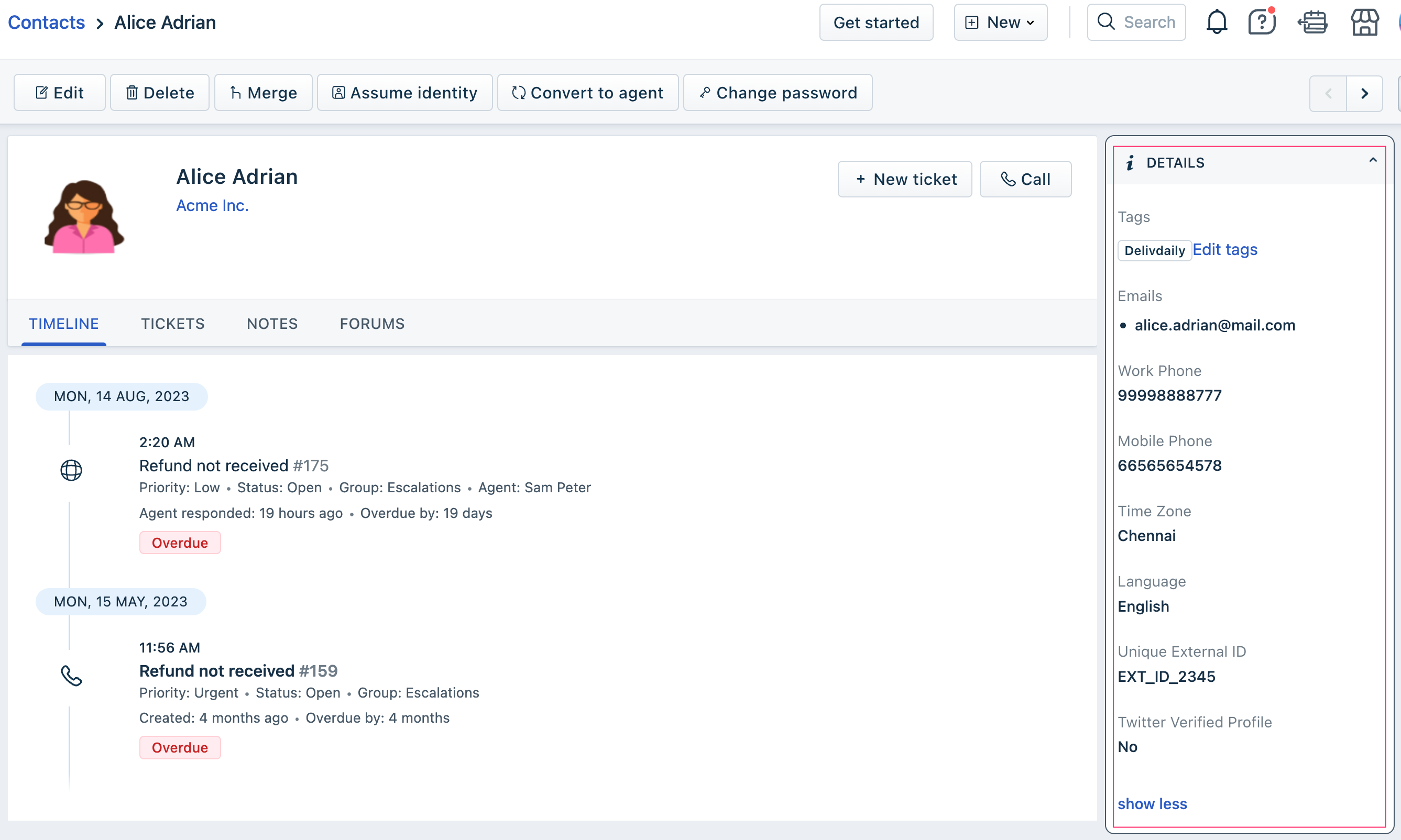
DETAILS widget and Edit contact window fields
The product UI displays a contact’s details, in the DETAILS widget of the Contact details page.
 This image highlights the DETAILS widget
An agent can use the Edit button on the top tool bar and view the Edit contact window.
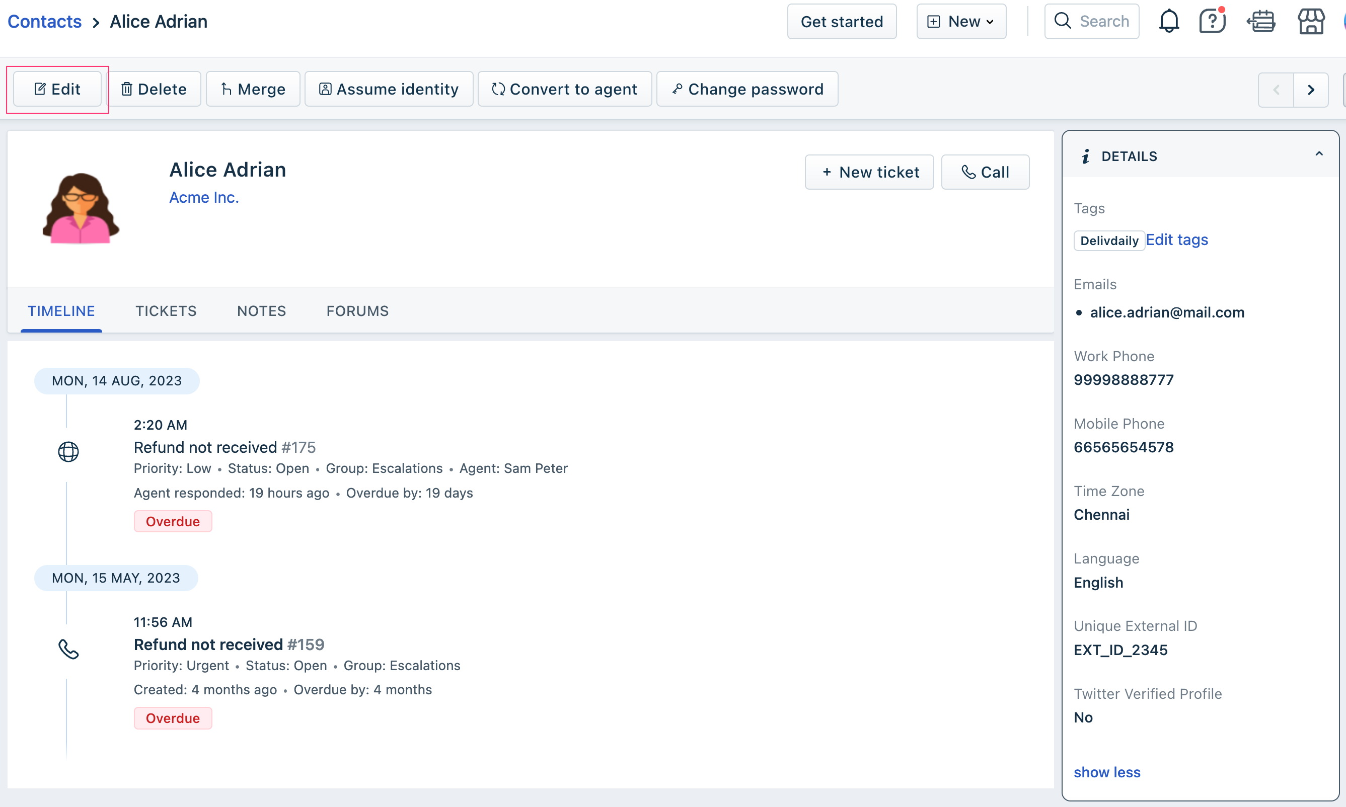 This image highlights the elements the app can on
An app can act on the following elements (fields) of the DETAILS widget, the Edit contact window, and the Contact details page.
Important:If an app hides/shows or disables/enables an element in the Edit contact window, it is unavailable/available in the DETAILS widget too.
| Field (default display) name | Element name to be used in app.js |
|---|---|
| On Contact details page | |
| Edit button | contactEdit |
| Tags | tags |
| Unique external ID | unique_external_id |
| Mobile Phone | mobile |
| twitter_id | |
| Address | address |
| Phone Number | phone |
| Language | language |
| About | description |
| Time zone | time_zone |
| Any custom field (Corresponding element name: element_name) | element_name |
| On DETAILS widget and Edit contact window | |
| Tags | tags |
| Unique external ID | unique_external_id |
| Mobile Phone | mobile |
| twitter_id | |
| Address | address |
| Phone Number | phone |
| Language | language |
| About | description |
| Time zone | time_zone |
| Any custom field (Corresponding element name: element_name) | element_name |
Use the sample code on the right pane, with the appropriate element name, to hide, display, disable, or enable these fields.
Edit contact window fields
The product UI displays all contacts available in the system in the Contact list page.
For any contact, an agent can select the Edit menu-opiton, to view the contact’s details in a Edit contact window and edit the details.
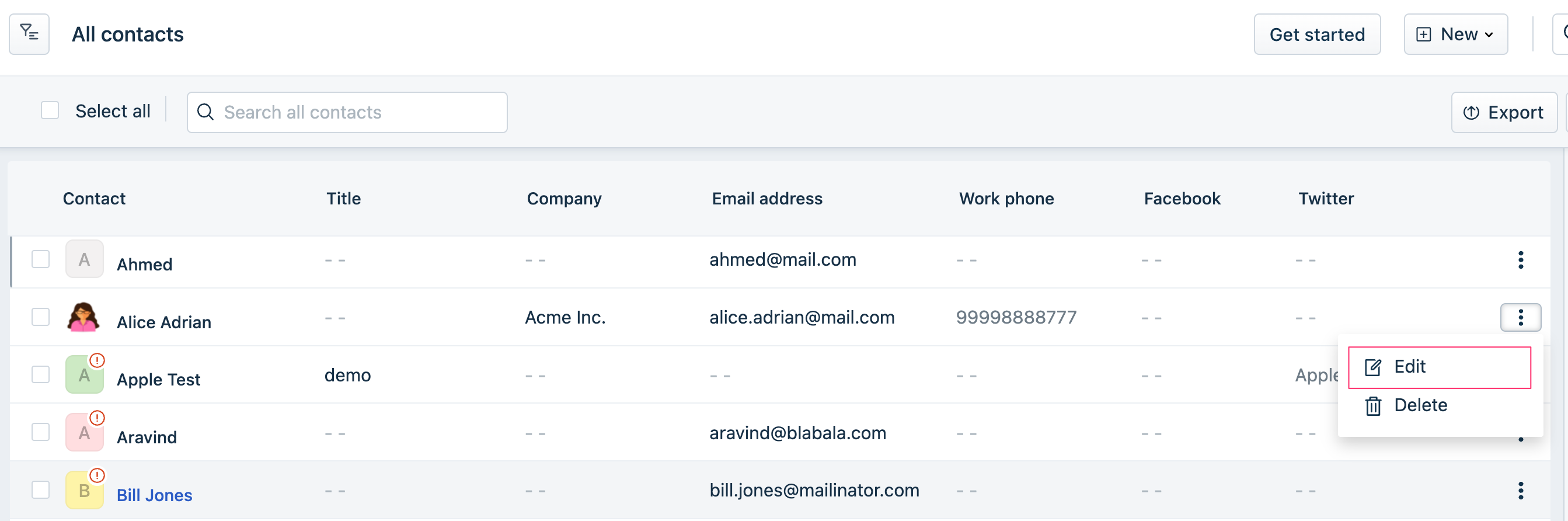 This image highlights the elements that the app can act on
An app can act on the following elements (fields) of the Edit contact window and the Contact list page.
Important:If an app hides/shows or disables/enables an element in the Edit contact window, it is unavailable/available in the Contact details page > DETAILS widget and Ticket details page > CONTACT DETAILS widget too.
| Field (default display) name | Element name to be used in app.js |
|---|---|
| On Contact list page | |
| Edit menu-option | contactEdit |
| Tags | tags |
| Unique external ID | unique_external_id |
| Mobile Phone | mobile |
| twitter_id | |
| Address | address |
| Phone Number | phone |
| Language | language |
| About | description |
| Time zone | time_zone |
| Any custom field (Corresponding element name: element_name) | element_name |
| On Edit contact window | |
| Tags | tags |
| Unique external ID | unique_external_id |
| Mobile Phone | mobile |
| twitter_id | |
| Address | address |
| Phone Number | phone |
| Language | language |
| About | description |
| Time zone | time_zone |
| Any custom field (Corresponding element name: element_name) | element_name |
Use the sample code on the right pane, with the appropriate element name, to hide, display, disable, or enable these fields.
Hide/display or enable/disable UI elements
To enable your app to hide an UI element, display a hidden element, disable a UI button, or enable a disabled button,
- Navigate to the app.js file. Subscribe to the app.initialized event, through an event listener. When the app is initialized, the parent application (the product on which the app is deployed) passes a client reference to the app.
- After app initialization, to a hide/display or enable/disable UI element, use the following method:<method-name> is the action to be performed. Possible values: hide, show, enable, disableapp.js
client.interface.trigger("<method-name>", {
  id: "<element-name>"
})
<element-name> is the element to be hidden or displayed; disabled or enabled.
DETAILS widget and Edit company window fields
The product UI displays a company’s details, in the DETAILS widget of the Company details page.
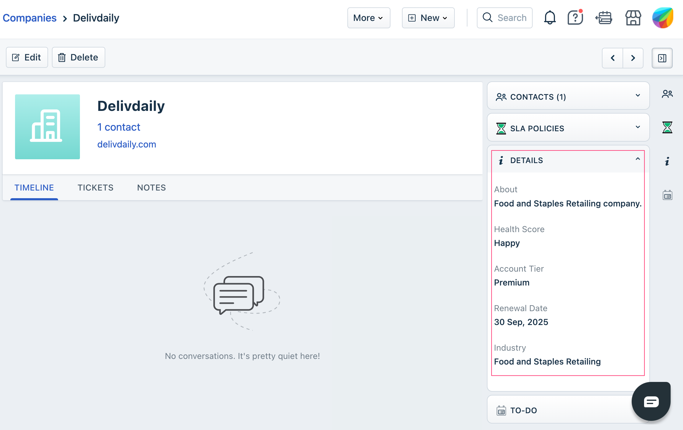 This image highlights the DETAILS widget
An agent can use the Edit button on the top tool bar and view the Edit company window.
 This image highlights the elements that the app can act on
An app can act on the following elements (fields) of the DETAILS widget and the Edit company window.
Important:If an app hides/shows or disables/enables an element in the Edit company window, it is unavailable/available in the DETAILS widget too.
| Field (default display) name | Element name to be used in app.js |
|---|---|
| On DETAILS widget | |
| About | description |
| NOTES | note |
| Domains for this company | domains |
| Health Score | health_score |
| Account Tier | account_tier |
| Renewal Date | renewal_date |
| Industry | industry |
| Any custom field (Corresponding element name: element_name) | element_name |
| On Edit company window | |
| Description | description |
| Notes | note |
| Domains for this company | domains |
| Health score | health_score |
| Account tier | account_tier |
| Renewal date | renewal_date |
| Industry | industry |
| Any custom field (Corresponding element name: element_name) | element_name |
Use the sample code on the right pane, with the appropriate element name, to hide, display, disable, or enable these fields.
Edit company window fields
The product UI displays a list of all companies available in the system in the Company list page.
For any company, an agent can select the Edit menu-opiton, to view the company’s details in a Edit company window and edit the details.
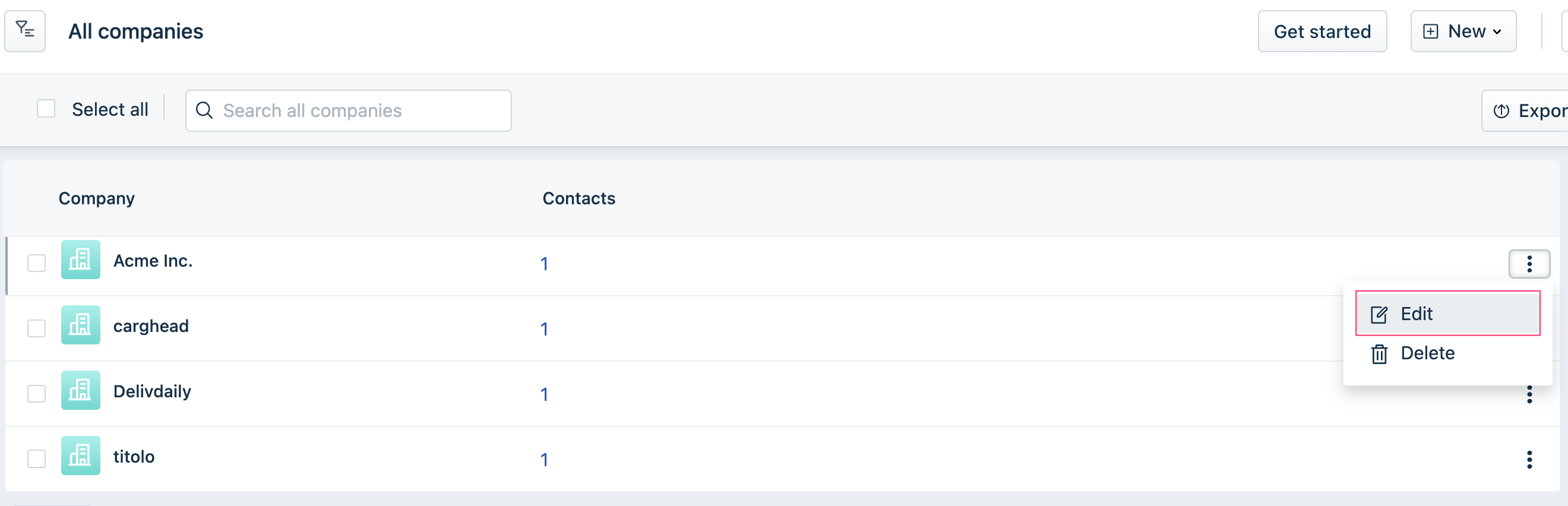 This image highlights the elements that the app can act on
An app can act on the following elements (fields) of the Edit company window.
Important:If an app hides/shows or disables/enables an element in the Edit company window, it is unavailable/available in the Company details page > DETAILS widget too.
| Field (default display) name | Element name to be used in app.js |
|---|---|
| On DETAILS widget | |
| About | description |
| NOTES | note |
| Domains for this company | domains |
| Health Score | health_score |
| Account Tier | account_tier |
| Renewal Date | renewal_date |
| Industry | industry |
| Any custom field (Corresponding element name: element_name) | element_name |
| On Edit company window | |
| Description | description |
| Notes | note |
| Domains for this company | domains |
| Health score | health_score |
| Account tier | account_tier |
| Renewal date | renewal_date |
| Industry | industry |
| Any custom field (Corresponding element name: element_name) | element_name |
Use the sample code on the right pane, with the appropriate element name, to hide, display, disable, or enable these fields.